

Equilibria
Identity Oil & Safety

Corporate Identity: Equilibria, Realizing Potential

Secondary Identity: The "e-Man".

Corporate Stationery: Business Card

Marketing Materials: Corporate Brochure Cover
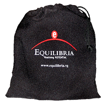
Ad Specialty Marketing: Bag with "e-Man" Character Color Cards Inside for Training.
Equilibria
Identity
Logo design, Created original illustration for the company’s sub-identity “e-Man”.
Challenges and Results
This company's service is conflict resolution and safety in the oil industry market. Laurence needed to create the brand with the added challenge of creating a sub brand icon of a figure that identified to the main brand and that would also later be animated. The sub brand was to represent the different personality traits between a client’s management team and their staff members. This was a graphic color code system used for a single or dual character traits type analysis and coaching in the oil rig industry. Laurence cleverly designed the logo with the “e” in the circle that then transformed into the head portion of the “e-Man” sub brand. Laurence created and produced all designs as independent Brand Design Director.